Qur’anic Study Tool

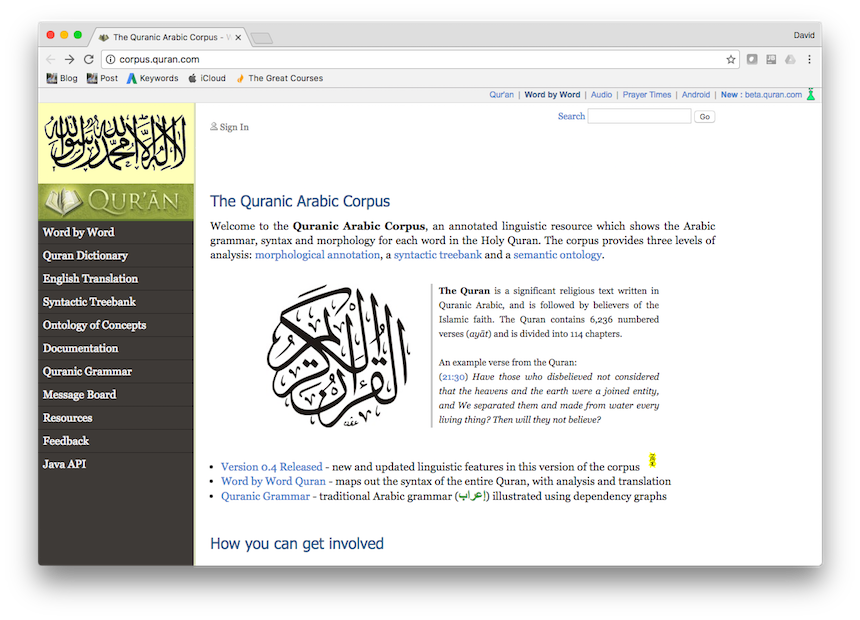
During my study of the Qur’an, I came across this website:

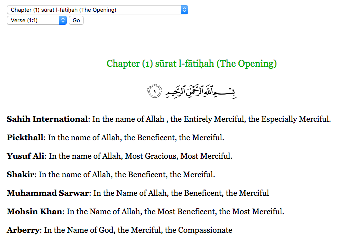
I have to say, I’m really rather impressed. The site allows me to compare different Qur’anic translations, which has proved very helpful in discerning the meaning of obscure verses:
screen-shot-2016-12-16-at-8-28-56-am

It also has an ontology graph, showing the relationships between different concepts in Islam.
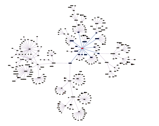
screen-shot-2016-12-16-at-8-27-05-am

There’s also a considerable material here on grammar, which I’m sure I’d find useful if I actually spoke Arabic:
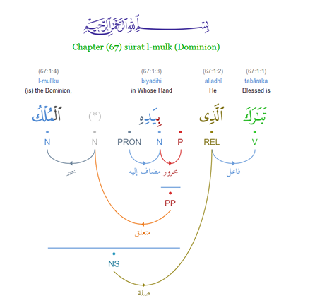
screen-shot-2016-12-16-at-8-29-48-am

The only thing it doesn’t have which I’d find really helpful is integration with the hadith, since context is still my #1 issue when reading the Qur’an…
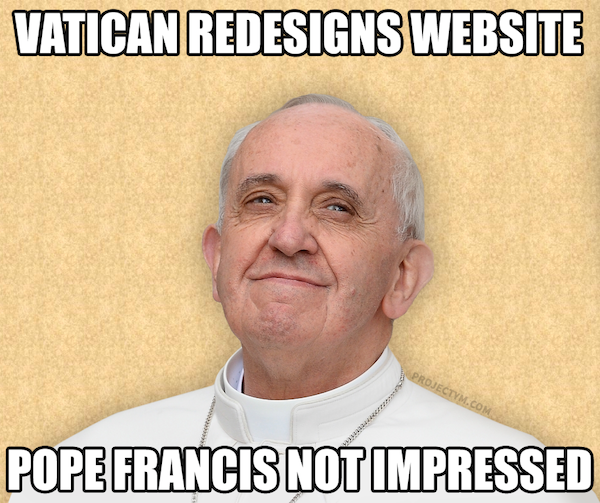
Vatican Website Updated!

*sigh*…the Vatican website has been updated again…and it’s still terrible.

Website

Here’s a selection of my favourite comments about this that I’ve seen on Facebook:

At World Youth Day, Pope Francis did say, “Go, make a mess!”
The Vatican web-designers took him literally.

What the… Great, now I need to go to confession.

There are no ‘boing’ noises when I move the cursor to a hyperlink. Why are there no ‘boing’ noises?

I thought Lent was over? Why are we still being made to suffer?

The church should recognize that IE 6 makes Jesus cry.

Look, someone discovered how to use the <table> tag in HTML!

I’m not too keen on the Times Roman font. They really should be using Comic Sans!

You know, for an outfit that’s big on infallibility, this really doesn’t bolster their cred…

Meet the new website, same as the old website.

Maybe they used the folks who did the new translation of the roman missal.

Still Better Than Obamacare

Top Five Tips for Parish Websites

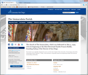
Yesterday I wrote a post about the importance of parish websites and how they can play a key role in attracting people to your parish and integrating them into parish life.

Today I would like to follow up on this topic and speak a little bit about some of the thought which should go into the construction and structure of your website. Having a website is not enough. It must also be functional and engaging.

With that in mind, here are my top five tips for parish websites:

1. “When’s Mass?”
If I’m going to a parish’s website, chances are I’m looking for the Mass and Confession times. Please don’t make me have to click around for five minutes and dig into submenus before finding them.

Mass Times

Read more

Parish Websites

rantOkay, small rant alert…

Bad parish websites. They have to stop. Seriously.

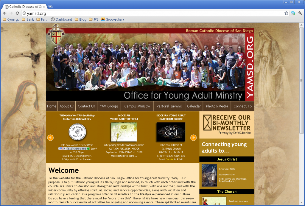
I never fail to be amazed at how little time, attention and money is devoted to the websites of some Catholic parishes. It’s 2013 people! Bad parish websites are now simply unacceptable.

If you arrived at a parish for Mass for the first time and you walked through the front door and are greeted by 70’s decor, peeling paint and a sparsely populated notice board containing only out-of-date notices, what conclusions would you reach about that parish? Well, having no website or an extremely poorly produced or out-of-date website is the digital equivalent of that today. A parish’s website, or lack thereof, is the first impression most people will have of that parish.

Read more