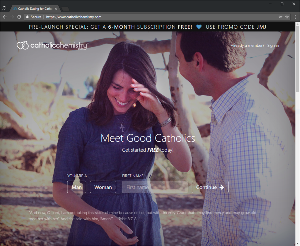
New Catholic Dating Website Launched!

For the last couple of months, I have been helping beta test a website which is being launched by a friend of mine. Normally, I’m the one writing the code, so it was a lot of fun having an opportunity to find the bugs in someone else’s work!
Although I’ve known people to find their spouse on CatholicMatch.com, I also know of a lot of people who have found the whole online dating experience frustrating. If this is you, you might like to try CatholicChemistry…
 Click on the link above and sign up with the promo code “JMJ”, you’ll get a 6-month subscription for free. If you’re not sure how to start the conversation and get a date, you might like to try some of my favourite Catholic pick-up lines. You can thank me in your wedding toast… 😉
I’m intrigued … as I really dislike the swiping and scrolling of Online Dating – it’s easier to find a new kitchen utensil on Amazon, and always feels like shopping for things on Amazon to me. So I went through their sign up process and can’t fully figure out “their thing”. What makes this different than the other dating sites? The questions? (I do like their format) The matching? The type of person who signs up? The look? (which is much better than anything else) How does it work? Maybe these are all things that they are working on and it’s just a little early… (or maybe I’m a natural skeptic, maybe I should add that to my profile!)
Hi Katie, these are great questions and ones we’ve mulled over for months! Our motivation has been to build a better Catholic dating site to facilitate relationships that glorify God. 1) We’re Catholic and our faith informs everything we do: how we word our profile questions, who we market to, the catechetical info we infuse across the site, our discernment page, and more. Even in little things, like quoting scripture in our terms of service. 2) We provide more opportunities for meaningful connections: for example, our “Which is more you?” questions is a fun interactive feature with lots of positive feedback so far (we’ll be expanding this feature more). Another example is we’ve turned most member content into conversation starters with our “Respond to this” feature. 3) We built a modern and attractive interface: easy to use and navigate, beautiful and minimalistic. Our profiles our concise: for example, is eye color really a deal breaker? Then why do other sites clutter your profile–your chance to express yourself–with such superficialities? We’re just getting started, have many development plans, and are very interested in feedback from our members as we continue to improve. Please don’t hesitate to send us your thoughts and comments at CatholicChemistry.com’s contact us page. We’d happy to hear from you! God bless.
Thanks for sharing. It definitely felt different going through the profile making process than other sites, I hope to see more of what you’re doing in the future!