Top Five Tips for Parish Websites
Yesterday I wrote a post about the importance of parish websites and how they can play a key role in attracting people to your parish and integrating them into parish life.
Today I would like to follow up on this topic and speak a little bit about some of the thought which should go into the construction and structure of your website. Having a website is not enough. It must also be functional and engaging.
With that in mind, here are my top five tips for parish websites:
1. “When’s Mass?”
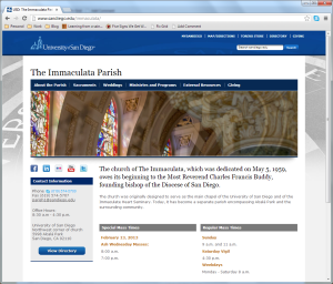
If I’m going to a parish’s website, chances are I’m looking for the Mass and Confession times. Please don’t make me have to click around for five minutes and dig into submenus before finding them.
2. “Where are you?”
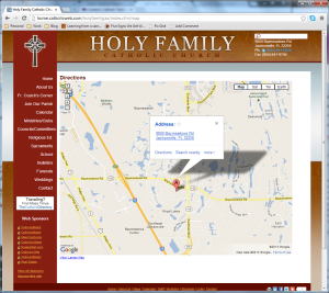
The other main reason I’ll be looking at a parish’s website is because I’m out of town and I’m looking for somewhere nearby to go to Mass. The address of the parish should therefore be easily accessible and not in some tiny font at the bottom of one of the pages. An embedded Google map is also very much appreciated 🙂
3. “Is anyone there?”
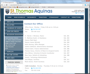
Provide me with a simple way of speaking to someone to find out more information. Provide me with telephone numbers and email addresses. I’m not a great fan of the “Contact Us” forms, but they’re okay as long as someone actually checks the messages sent from them. This rule is equally applicable for emails. I’ve lost track of the number of times I’ve filled in online forms or sent an email message to the parish and never received a reply.
4. “What goes on here?”
You want the visitor to your website to get a good idea of what parish life is like. The information on the website must, must, MUST be kept up-to-date. It is not going to fill me with confidence if I see that the last newsletter uploaded is two years old…
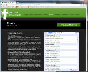
The website should advertise the ministries in operation at the parish and provide a way of getting involved. If you do this, it will be easier for new parishioners to integrate into parish life. The latest Parish bulletin/newsletter should be easily available for download. There should be a list of upcoming events or a calendar which people can easily integrate with their own electronic calendars on their computers or mobile devices. I thoroughly recommend Google Calendar.
5. Media
Few people want to read pages of text, so make sure you use plenty of engaging media:
(a) Images
Make sure the photographs on your website are of good quality. Show the wide scope of parish life. Include pictures of the clergy and the different ministry leaders.
(b) Audio
Make the Sunday sermon available for MP3 download or, if the priest is uncomfortable with this, you may like to link to the weekly sermons available online at WordOnFire.org.
(c) Video
Nobody is expecting you to become the next Stephen Spielberg. However, even the most basic of digital cameras are superb quality these days and there are free tools available to do the video editing. Why not produce a promotional video? Or how about a short video of the pastor welcoming the website visitor to the parish? Keep the quality high and make them short and to the point.
You don’t have to go crazy with media. Less is often more, but make sure you don’t completely neglect it.
There’s a lot more which could be said about parish websites (“Newcomer” pages etc) and I’m sure at some point in the future I’ll rant some more. However, if you pay attention to these five pieces of advice you’ll be well on your way to building a solid presence for your parish in cyberspace.
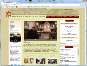
Angela has just drawn attention to a great parish website. Check it out!